When Sunday comic strips were first introduced, each strip filled an entire newspaper page. Then that was cut to a half-page. Then it was reduced further, but Sunday strips still kept the same half-page dimensions -- it was just up to the paper how MUCH of each strip should be printed and at what size. To help with this task, various "formats" were invented to allow comic strip panels to be jumbled into two-row, three-row and fourth-row reconfigurations. Certain panels were designated "non-essential" and had to be written under the assumption that they might not be used.
There were some cartoonists that did their best writing camouflage to attempt to disguise the throwaway panels, but it was a wasted effort -- other cartoonists wouldn't even try, wasting the panels on obvious filler content and making the whole trick very obvious. However, the method by which this was done differed from comic to comic. Here are nine of the most common ways to fillet a comic strip.
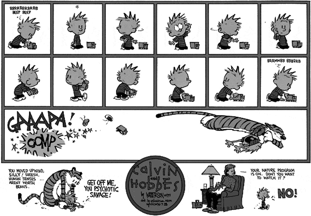
CALVIN FORMAT
Used by: Calvin and Hobbes (early years), For Better Or For
Worse, BC, Cathy, FoxTrot (first decade), Luann (first decade)
This is the only newspaper comic format that will allow a strip to display its entire content in each layout with no panels cut. The tradeoff, however, is that the mandatory divisions are more restrictive than they are in most other formats. Your second row MUST be divided in the middle and the final row's first panel MUST be square-shaped or else.
Many, many strips hated the thought of having panels removed and made the compromises necessary to use this format, so I got used to seeing those obvious panel divisions and throwaway gags a lot. When I think about this format, though, Calvin and Hobbes always comes to mind first...not due to Watterson's hatred of it and resulting attempts to disguise it, but probably because of that. The Calvin Format looks best when the page is mathematically divided into eight perfect squares; Watterson would often do the opposite, exposing the confinements bare.
GARFIELD FORMAT
Used by: Garfield, Peanuts, Blondie, Amazing Spider-Man, Tank
McNamara
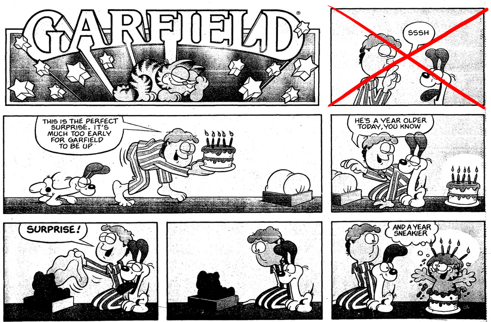
This is a format best suited to jokes that can be told in six panels. Three are in each row, with the top row being used mostly as a logo banner. It's the top right panel that suffers, being cut in all formats except the original half-page. Since barely anyone will see that panel, it's usually spent on a wordless setup drawing.
DOONESBURY FORMAT
Used by: Doonesbury, Hi & Lois, Beetle Bailey, Hagar The
Horrible, Archie
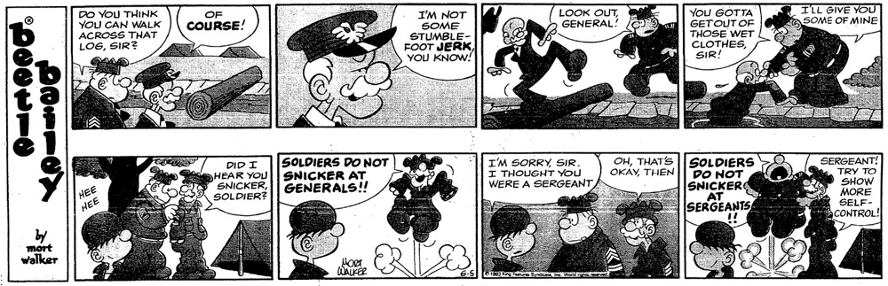
Very similiar to the Garfield Format, with one distinction: the panel that gets thrown away is the one with the logo on it. While this makes far more sense....where is the logo going to go now? The solution is to stick a narrow vertical banner on the left side and awkwardly shove the title in there, one letter at a time. If it weren't for that ugly touch, this would look perfect.
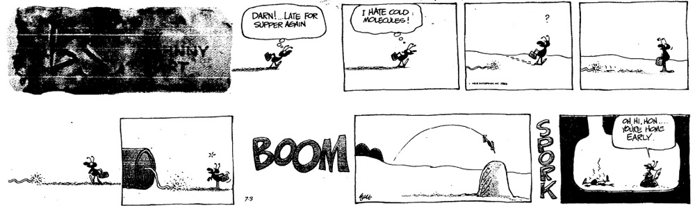
POGO FORMAT
Used by: Pogo, several soap opera strips, Dennis the Menace
(until the 90s)
Of all the places where a throwaway panel could be, THE MIDDLE OF THE STRIP sounds like the most annoying to deal with. It means the second or third panel of your strip has to be inessential and easily removable -- just when the joke gets going, it has to be hobbled by an extra beat. In addition...why would you not put the throwaway panel in the row that has a high probability of getting tossed out as well? The others have the sense to put it in the first. But a throwaway panel in the SECOND ROW? What a nightmare.
I feel like the legendary Walt Kelly would be too intelligent to prefer to work this way if he could help it. Maybe he had no choice -- maybe this is the format his syndicate demanded. The world may never know the truth.
HALF-CALVIN FORMAT
Used by: Judge Parker, Rose Is Rose, the Scancarelli years of
Gasoline Alley
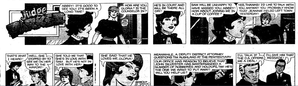
It's a lot like the Calvin format, except it assumes no one is going to stack the strip into four rows and gets rid of those divisions. Only the center row split remains mandatory. If you're going to go that far, you might as well use the format below, which is why this isn't seen often.
ARNOLD FORMAT
Used by: Arnold, Outland, The Family Circus, Tiger, Mutts, The
Boondocks, nearly every comic strip produced from 2000 onward
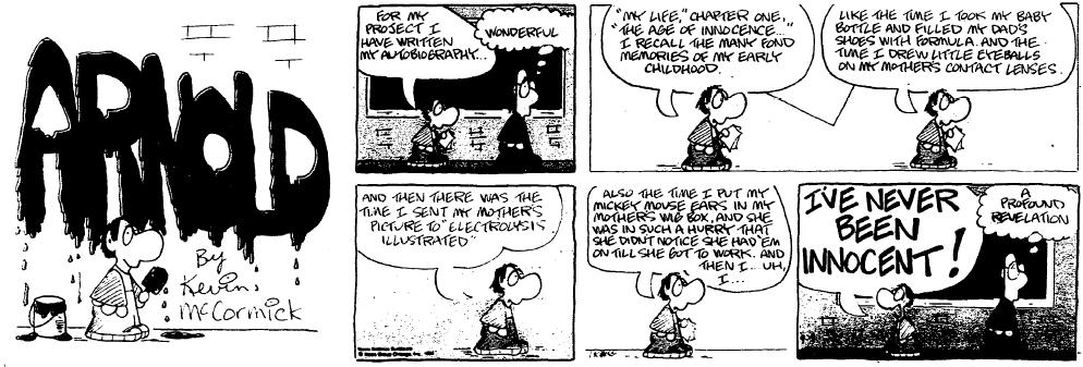
I'm well aware there have been comic strips that used this format better than friggin' Arnold, but...get your own website if it bothers you that much. We're calling it the Arnold Format around here for inscrutable reasons.
The Arnold Format reproduces the strip in the fourth-page as one unbroken slice on the right, and a large square logo to the left. It offers no panel restrictions whatsoever on the lower two rows, as long as you're fine with the first row probably not making it, and some layouts like the four-row stack being impossible. In the olden days that might have reduced the amount of papers that would carry you on Sundays, but as the use of the four-row layout has mostly gone extinct, the Arnold Format has grown in popularity, to the point that nearly every newspaper comic introduced in this century uses it.
In the right hands the Arnold Format can push comic strip art to some great heights. Bloom County, for example, switched to the Arnold Format in its last two years and did some eye-popping things no one else was doing at the time, like making some panels much larger than others.
This is wasted by Dilbert, which has used the Arnold Format for its entire existence yet produces every Sunday strip in eight identical squares, something that could have easily been done with no changes in the restrictive Calvin Format. Makes about as much sense as anything else Scott Adams says or does.
HALF-PAGE FORMAT
Used by: Calvin and Hobbes (later years), Opus, an educational
kid-strip called "Shortcuts"
Bill Watterson hated the Format we just named after his strip, and used his clout as the Most Successful Strip-Man Of The 90s to completely break free, returning from his first sabbatical with an unaltered, uncut half-page. Had newspapers continued to be a staple of American life in the 21st century, this might have set a precedent where each cartoonist that makes it big pressures their syndicate to offer them total freedom, but it only happened here and in the 2000s when Berke Breathed returned.
PRINCE VALIANT FORMAT
Used by: Prince Valiant, Mark Trail, the Star Wars strip
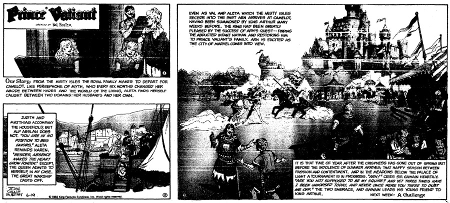
This is as adventurous as you can get while still making it possible to cut a strip up. One enormous panel on the right can be filled up with whatever you want. Two smaller panels exist on the left as well as on the top -- they can be restacked to form the shape of a fourth-page layout or a four-row layout. As wild as it looks, it's really only good for that giant panel -- you can't cut it up without wrecking the readability of the strip in the alternate layouts.
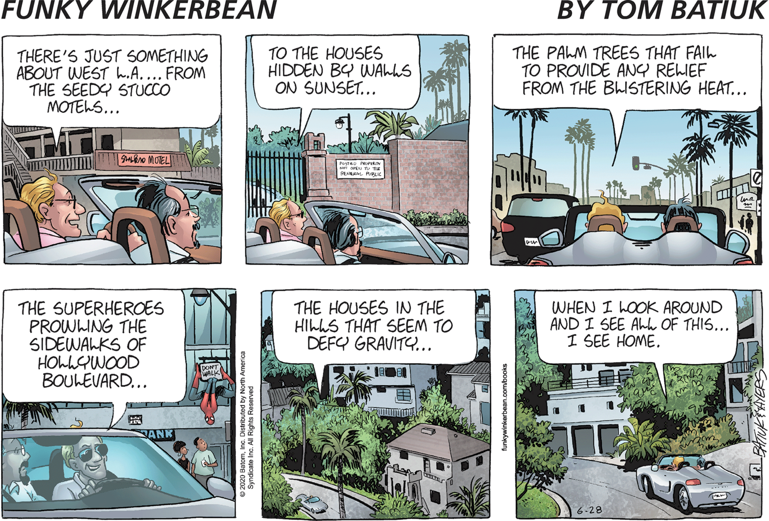
FUNKY WINKERBEAN FORMAT
Used by: Funky Winkerbean
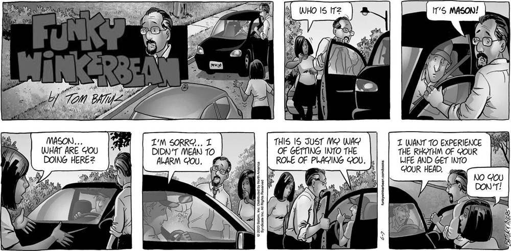
If there's anything I understand even less than a depressing strip about death and despair being called "Funky Winkerbean," it's the unique and utterly bizarre format it uses. There is no top row. Instead it's the first of the remaining two rows that's meant as the throwaway, meaning only FOUR PANELS are allowed to be essential. You can also throw out the logo panel and stack the other six in a shorter two-row display...they are formatted for this, but it's a rare scenario that any paper would use such a weird shape.
My hometown paper ran Funky Winkerbean in the 1990s, but just on Sundays, and they stacked the panels vertically. About a year after it first appeared, it switched from a gag strip about a high school marching band into a drama strip about an incredibly unlucky woman named Lisa getting tortured, and seeing that play out in patches once a week was rather confusing. Let me add that Batiuk needs professional help.