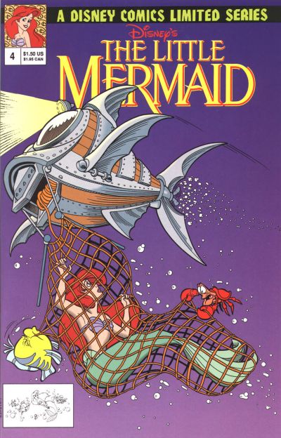
This is a cover I remember seeing at Fred Meyer back when comic books were mainstream enough to sell in huge racks at the supermarket. This was also when Fred Meyer had those dot-matrix display things installed in the ceiling of every aisle, and they constantly said things like "USE COUPONS!" ...Look, I don't know where else I could have brought that up. Some memories are completely useless but they have to be said. I didn't buy this comic. It was The Little Mermaid, and I abhorred all things Little Mermaid for being "too girly." But this image stuck with me for years after I left the store that day. It bugged me that I'd never know who was driving that weird ship -- were they humans? Did they discover Ariel? And was it by accident or on purpose? Did they bring the net up? (They better have brought the net up.) The best covers stand alone by their art. The ideal comic book cover depicts something so interesting that you have to look inside the book to find out more. In olden days, they used to cheat to do this by putting out intentionally misleading covers where Superman kills Lois or Batman's gravestone is shown. That's why there are no picks from the Golden or Silver Age here...I find the gimmicks disqualifying. It's only recently that word balloons and corny dialogue were banished from comic covers, as well as printing quality becoming good enough for truly impressive creations to appear. For example....
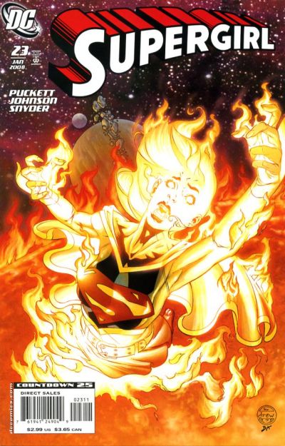
If one of the things you can potentially do with your character on a cover (and still have her live) is have her drown on the surface of the sun, you should have thought of it decades ago.
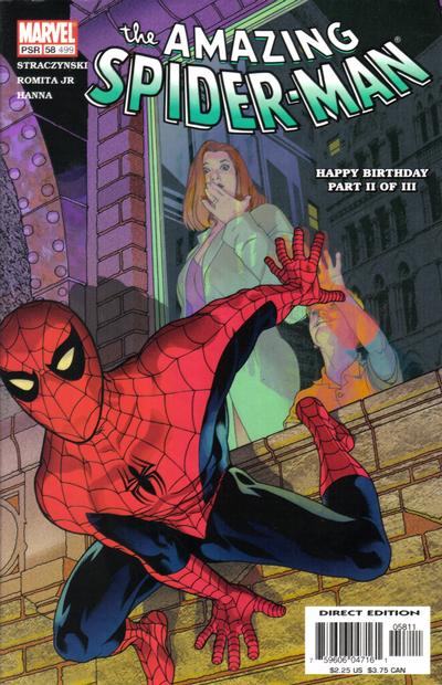
It's my opinion that this is the best Spider-Man cover of all time. There are others that are a lot more famous, there are some that are iconic, but none of them feel like this one does. We know Spider-Man top to bottom. We know everything about Peter Parker, the guy inside the webbed spandex. We know his hopes, his dreams, his misfortunes and his triumphs. We know who he cares about, who he despises, and if we're keeping score, which parts of his life have and haven't been retconned this month. We don't know anything about this kid. And in turn, the kid doesn't know anything about Spider-Man. To this kid, Spidey is the coolest dude in the world, with the coolest job in the world, and Spidey's life is way better than his. He doesn't have to eat vegetables or clean his room. He fights aleins and doesn't afraid of anything. He'd never hang out with some nobody third-grader. Then suddenly, WHOA! THERE HE IS! THIS IS THE GREATEST MOMENT OF MY LIFE!!! The best element of it is that Spider-Man has no idea this is happening. He'll be gone in about two seconds. He'll never see the kid; he'll never know how he affected his life. They'll go their separate ways forever, and they'll each live out their lives elsewhere, never meeting so close again. The camera follows Spider-Man, but we never think about the extras. All those other people are people too. I just think that's a really powerful, fascinating story to tell in one picture.
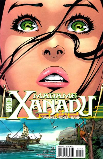
Any one of the Xanadu covers would have been good entries here (seriously, check 'em out, they're gorgeous). But this one bowled them all over. In fact, I think this is the best cover ever. For anything. If this were a movie poster, the movie would have been remembered for ages just because of its ad campaign. If it were a Renaissance painting, it would have been parodied more times than the Mona Lisa. If you had to illustrate the emotion conveyed in this drawing -- the "wow, what is that?" this girl is feeling -- would you have thought of making it this way? To have 4/5 of the cover taken up by the expression of wonder on her face? That is so original! And it works so well! This is beyond just a cover, this is art. "It belongs in a museum."
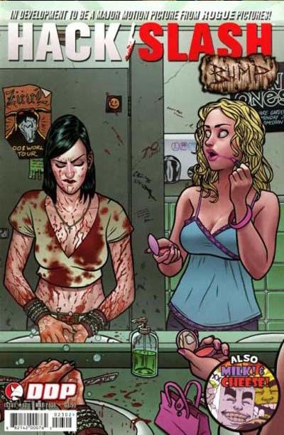
Outrageous characters work better when they're removed from their element and placed somewhere they don't belong. In my opinion, Addams Family Values was better than The Addams Family because they took the characters to locations where they didn't fit, and not just that, places full of irritating people that were begging to be annihilated by their brand of insanity. In the first movie they stayed in their house the whole time. Cassie Hack lives in the universe of slasher movies, where maniacs with chainsaws are hiding out at every summer camp, where stabbing anything will result in 78 gallons of blood gushing out (even a tree), and if you make a ventriloquist dummy, it will more than likely come to life and try to kill you. This vapid teenager, though from the same universe, has no idea any of that is going on. This picture was shot at the precisely perfect moment when she suddenly thinks "wait a minute....SOMETHING'S NOT RIGHT HERE..." Oh, and Milk and Cheese are on the cover too for some reason, so that's another 500 points for this.
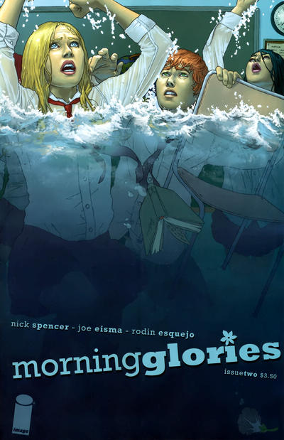
A fine specimen of cover perfection. They're drowning....in school? The classroom is flooding? Why? How do they get out? It's so unusual it grabs you right away. The stipulation to the deal, of course, is that there had BETTER BE a classroom filling with water inside this book, or everyone will feel cheated. Fortunately, there is.
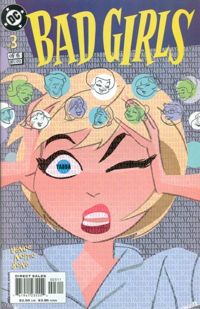
Doncha just love this art style?
Well, I have news for you.....
The interior art looks nothing like this. It's just typical, run-of-the-mill comic book drawings inside. That's lame.
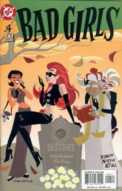
Darwyn Cooke should have been allowed to paint the whole thing. There's nothing that special about the storyline, but refreshing art would have helped it a lot.
Those of you who inspected the covers closely will note this was a six-issue miniseries that was cut down to five issues midway. No surprise there. What a shame.
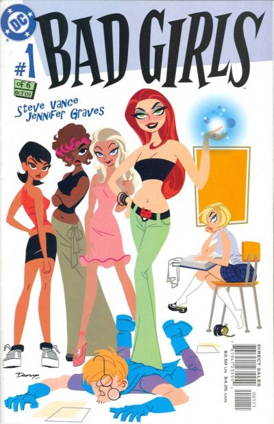
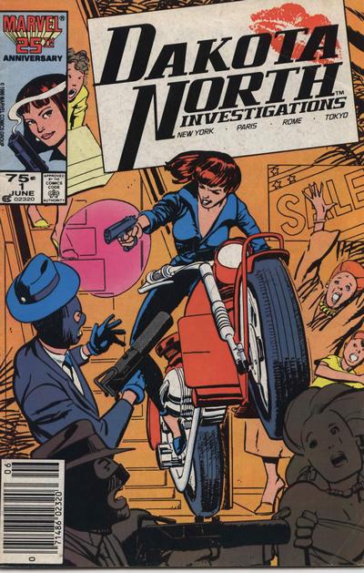
This cover ultimately inspired Dakota North's supporting role in True Believers. I don't think a lot of people would put this cover on their list of best ever, considering that there's so much going on that the artist had to draw a circle around the focal point of action to make it clearer. But here's why I have it here: this is a brand new character and the cover sells her successfully. The complicated setup is, I think, an advantage here. The viewer's brain goes through these steps: 1) WHOA, WHO IS THAT?
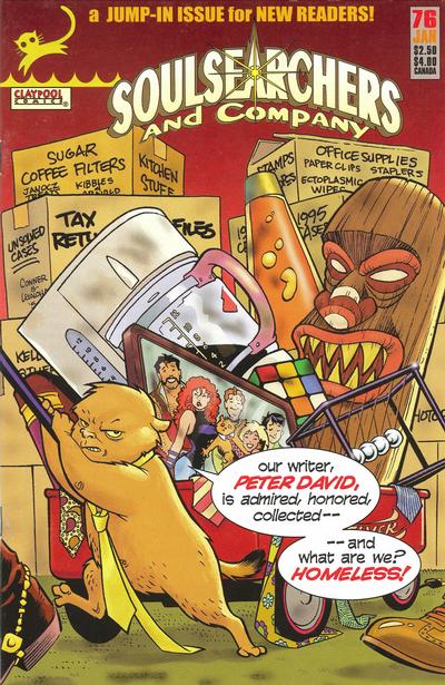
What I love about this cover is that it's not the gopher/groundhog thing chewing the comic store patrons out....it's Peter David speaking there. He's furious. Never heard of this one? Neither has anybody else on Earth except for David. He gained tons of fans and much-coveted respectability from his writing on various superhero comics....but when he tried making up his own characters and publishing indie, no one noticed. This is a human psychology problem that I've noticed happen more than once, and there should be a study done on it. When Katie Couric left NBC for CBS, it was like she ceased to exist. Then she spent one approximate week on Good Morning America, and the media was like "Wow, she's alive! Who knew?" It's the same person either way, but somehow she's not worth caring about if she's on a different network. That doesn't make logical sense. The comic was not long for the world by the time this came out; it had just HAD a "jump-in issue" not that long ago, which apparently didn't take. This was a last-ditch effort and Pete finally thought, "Screw all tact, I'm sick of the way this broken industry treats anything that hasn't already existed for at least 50 years. I loved these characters. Putting a bullet in their heads is like killing my own children! And it's not MY fault I can't make a profit off them. It's YOU! It's YOU FILTHY FANBOYS and your STUPID SUPERHERO ADDICTIONS! YOU CAN ALL TAKE THE EXPRESS TRAIN TO HELL, AND TAKE YOUR HEAVY BOXES OF WOLVERINE BACK ISSUES WITH YOU!!! SIGNED, PETER DAVID." JMS, Frank Miller and Alan Moore may have big mouths, but so far none of them have had the guts to scream at their customers directly on a cover. And even though I've never read this comic (it ain't easy to find) I agree with the message of this cover a hundred and fifty percent. Part of the blame for the comic industry's stagnancy lies solely with the customers. Shame on you. YOU put this rodent on the street.
Well, I just like it. This is the smartest thing I've ever seen a comic book villain do. |